Tuesday, February 16, 2016

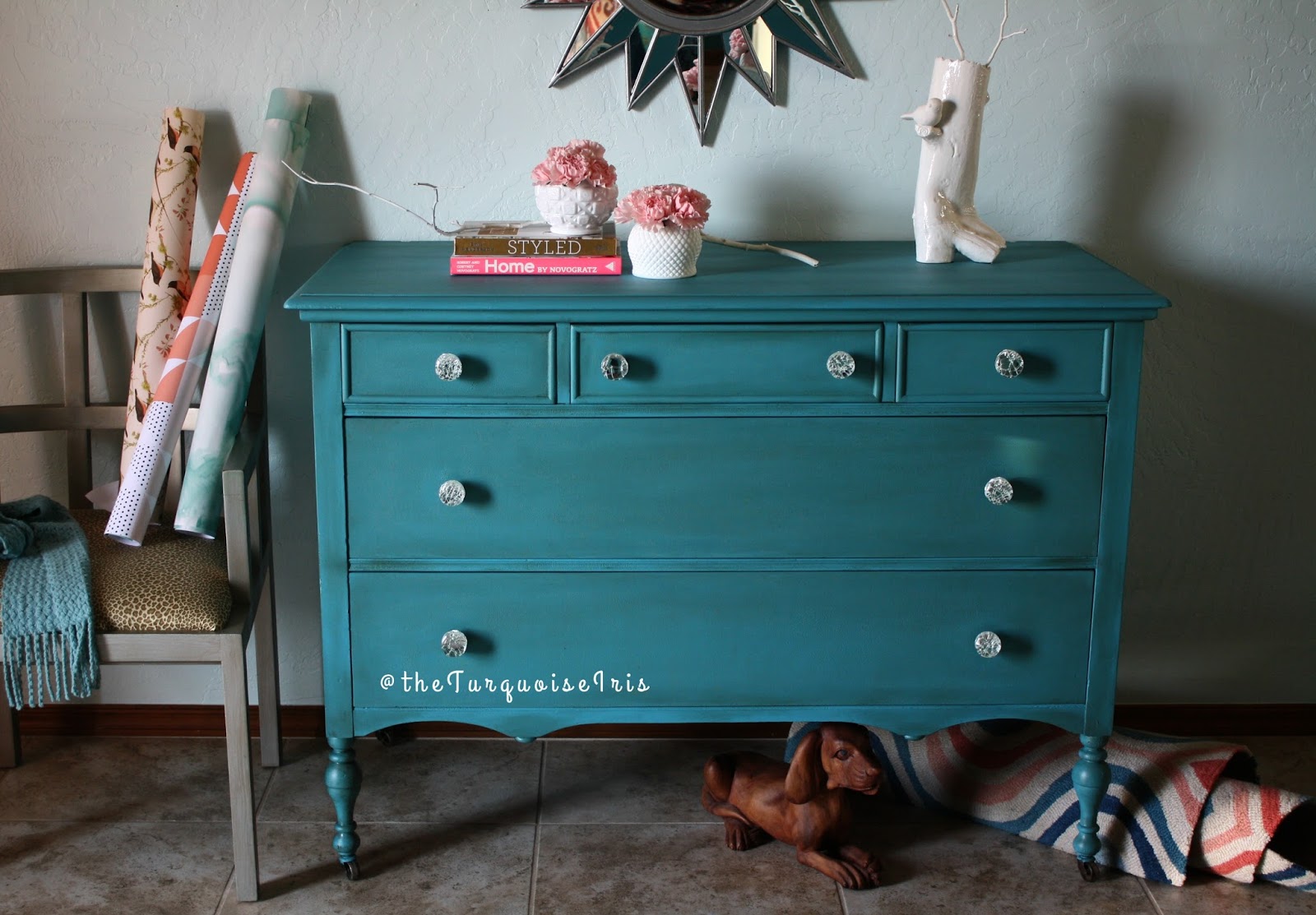
The Best Teal E-V-E-R!!!

     No surprise here but most of you know turquoise or any shade close to is my absolute favorite color. It always has been my go-to color. I can remember as early as first grade wearing a teal blouse for class picture day.  The funny part of that is I hated dresses so I wore a top with ruffles and denim jeans, worn out knees and all!

      I also think every home needs a tad of turquoise somewhere. Whether it be a vase, art or a single piece of furniture.  The color works with all design styles, warm or cool tones and looks exceptional as a stand alone against white.


This classic dresser deserved a timeless color and teal gets my vote. I replaced the original knobs with broken glass clear ones.  I can see this used a dresser in a nursery, girls / teen room for obvious reasons but I'd also love to see it shining in an entry way or hall area.  


[[[ BEFORE AND AFTER ]]] 


One last thought on teal...it really looks good on everyone!! If you haven't tried, do and let me know how cute you look!!

As usual you can find my furniture available HERE on my Etsy shop, The Turquoise Iris.

~Dionne


Thursday, February 11, 2016

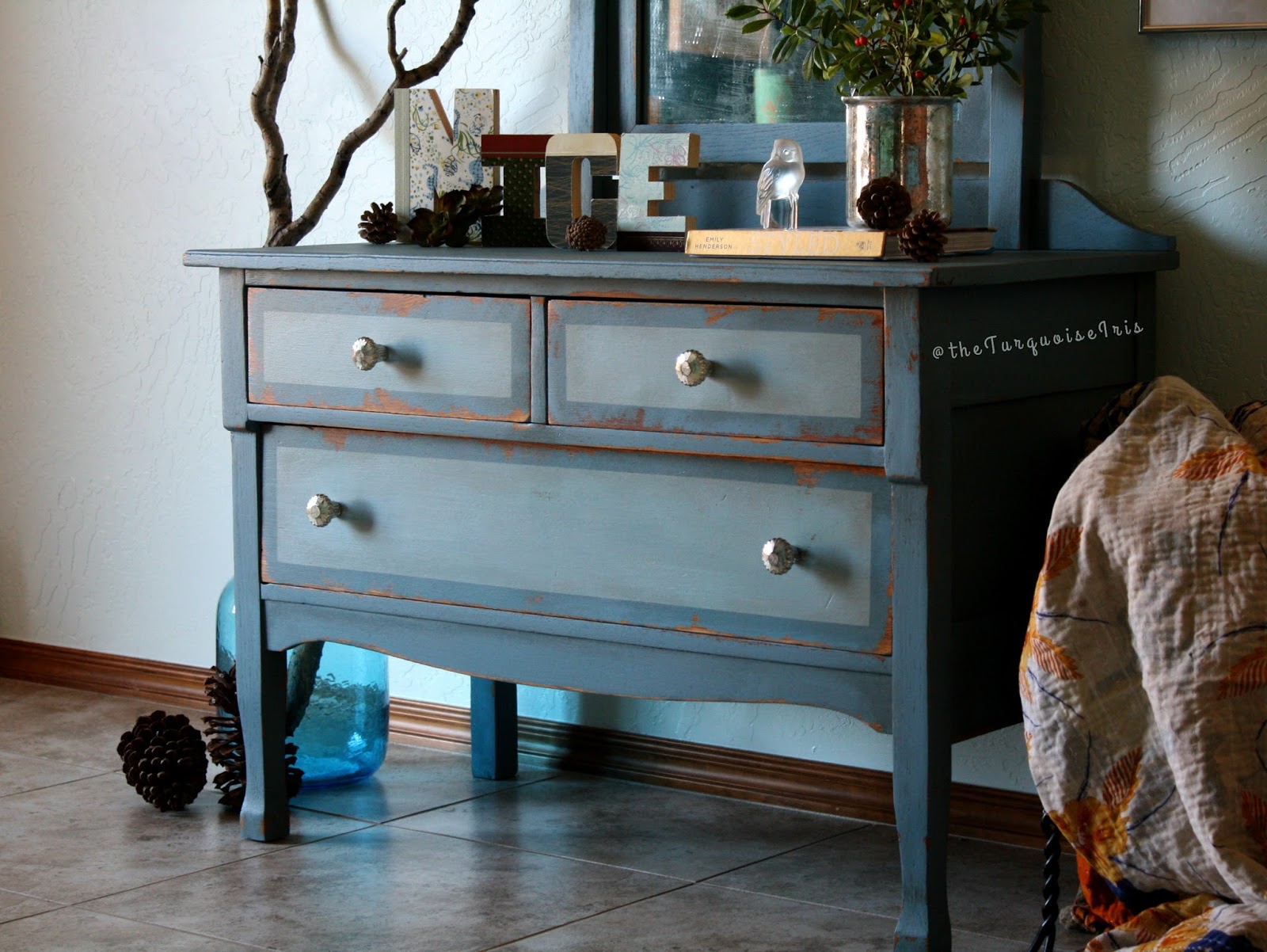
Before & After in 2 Tone Blue

Can I first say how much I adore those letters? N-I-C-E!!  Thanks to Hobby Lobby for having them on their 80% off section. You should've seen me trying to make a "cute" word from the letters they had left.  I may or may not have made a big mess...


BEFORE & AFTER 


This dresser is solid oak and full of tradition.  I didn't want to change that but wanted to add a fun color and some dimension to the drawers. I think this color is happy and I'm already dreaming about Spring, aren't you?


Obviously, I can see this as a bedroom dresser, but I also think it would
 make a great entry or hall piece.  Remove the mirror and you have a 
side table or night stand, too.


~Dionne

Thursday, January 28, 2016

I Learned a Little Something Today

My client contacted me over a month ago looking for a piece of furniture like this one.  I was thrilled when I found this one on Craigslist! I never find anything good there.  He requested "white Nordic ornate" with heavy distressing.  


 1. I didn't know what that meant, exactly. He expressed his ideas with me for the finish and explained a heavy Jacobean contrast.  

2. Since it's a custom, I felt added pressure to get it just right.  He had a very clear vision for this makeover.  

3.  His confidence in me and my work gave me the assurance I needed.  I blazed in to this unsure but ended feeling pretty proud! 


I sent him photos but I can't wait for him to see it in person next week! It's headed to Waco, TX.


Here's an image showing the progression with the paint finish. I'm smitten.

~Dionne

Saturday, January 23, 2016

When White Jumps Up and Bites You on the Derriere

     If you've followed me for awhile, you have noticed I don't paint furniture white very often. It's not that I don't like white, but I know white furniture is easier to find...in furniture stores, that is. I've prided myself on using colour and not shying away from the boldness it brings. 


However, this buffet is all white.  I take that back - I used a creme to highlight the details and bring out the original charm. Friends, I can't stop looking at this buffet now.  I adore the one cobalt blue agate knob, it's a crowning jewel on a tired piece once stowed away in a garage. 


The turquoise marble paper adds a simple but elegant look to the single drawer. 


"There is a kind of beauty in imperfection".
~Conrad Hall


I can say for sure, you will see me painting with white more often, 

Happy Saturday!:-)

~Dionne

Wednesday, January 13, 2016

The Best Gray Ever

I painted this entire antique bedroom set for my client.  We settled on this perfect shade of gray. She wanted blue and her husband wanted gray. Don't you think this is the perfect compromise?


Show me one person that doesn't love the design of this bedroom set! The original style is so unique and well made.  The paint just brought out the "pretty" in it.


I mean really....LOOK at this table!


Upon seeing this finished dressing table, my client said it brought tears to her eyes.  Now that makes me smile and warms my heart. I also painted the bed but forgot to get some good photos! oops;-)

Have a wonderful week!

~Dionne

Sunday, January 3, 2016

Turquoise Cabinet painted in Highfalutin Chalk Paint

This piece is special because I used Hifalutin' chalk paint from Brush & Bristle. 
They were generous enough to send me two colors to try out and I absolutely loved it! 
The colors on this vintage cabinet are Petty and Yonder. Gorgeous colors, right?


Click  HERE on my Etsy shop, The Turquoise Iris, to view more details.


BEFORE & AFTER 


Most of you all probably prefer one chalk paint over another but if not, you need to give this a try!

Happy Sunday;-)

~Dionne

Friday, December 18, 2015

Antique Buffet in Gray & Creme

This is very neutral for me to do, right?!?!
I've been wanting to try the Amy Howard Home paints from Ace Hardware. So, when I bought this buffet I knew this was just the right piece for her paint.  I love it and I think these colors are beautiful.


I had the best time staging this buffet, too!  I haven't even put everything back up yet.  I'm just enjoying it all for now. 


It's freezing here in Oklahoma today!  Look, even my little statue friend needed a scarf!

Hope you all have  a very Merry Christmas and Happy Holidays! 

~Dionne